Where Black entrepreneurs & professionals
innovate without compromise.
A 100% government-funded initiative rooted in university partnerships & community innovation.
Get inspired by other underrepresented Black professionals on the same journey as you.


“I recommend this program to anyone willing to learn how to better themselves and grow their business. On top of networking opportunities outside of class time, I found a great support system of peers to help each other mentally. I learned a lot about myself as a business owner, and how my emotions can affect my profit, growth and skills. Getting to learn different points of view in a free environment helps us build better opportunities to work together in the community by connecting and supporting each other to ensure growth in our business goals.”
Christine Robinson
Chef Chrissy Cuisine

“Joining this program was probably the most powerful professional and developmental experience that I could have had… The collective experience of different minds from the city coming together under one roof was so inspiring. We were all at different points on our career path, so I learned a lot from both the professors and my peers.”
Fahad Y.
Manager at a social housing provider
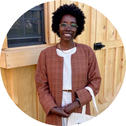
“Being in a supportive space week after week with Black entrepreneurs and end engaged educators was what germinated the seeds that had been planted. Being in the program through BEA helped open our doors to customers in the summer of 2023.”
Samantha Harris
Our Neighbours’ Farm and Homestead
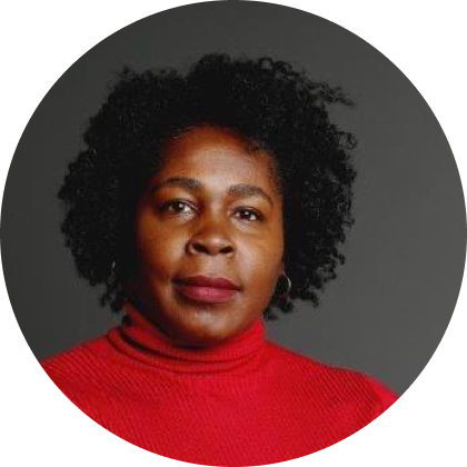
“BEA is the real deal! There are many programs in our community seeking to help entrepreneurs launch, grow and scale their businesses. BEA makes it happen! Not only do they provide you with the necessary training, skills, and education—they provide the connections that can give you the right opportunity to network and catapult your business to the next level.”
Donna Gardner
Mehetta Bammies

The BEA program allowed me to meet with amazing mentors and business resources that allowed me to "think outside of the box" where my business is concerned. With the help of this program, I can now pivot with confidence and reassurance. A big thank you to everyone involved with BEA. If you have a food or beverage business idea and want to take it to the next level, this is the program to get in.
Julie Denny
Sweet Treatz

The BEA team has been incredibly supportive of my early entrepreneurial journey. They've created an amazing community to help local Black founders like myself take their first steps!
Jonathon Bloomfield
Scooli

Honestly, since joining BEA I've grown exponentially as a founder. Their wealth of resources & amazing workshops have helped me accelerate the growth of our business. I truly believe BEA will be a catalyst to creating the top Black owned startups in Canada!
Meveille Mukoko
Yekola

This program was one of the best programs I’ve come across for my own personal growth in business but also just in confidence and readiness.
Chanee Dowdie
Honey Soul Food/ Cornbread Café

When MyPreconUnit.io becomes a household name...literally, and all puns intended, BEA will be the very group responsible for the shift in wealth equity because they believe in me and didn't let me quit.
Mutait Bello
MyPreconUnit

Innovation Hub Feasibility Study
Make Innovation Accessible for All. Fill out the survey to provide your insights, perspectives, and recommendations to inform a proposed Innovation Hub that will support underrepresented entrepreneurs and professionals.
The survey closes on August 18, 2023.